2024 Submissions
Artblocked
This is a short film I made to express what looking for inspiration when feeling artblocked felt like. I tried to explore as many different mediums as I could, to give the piece a more explorational feel.
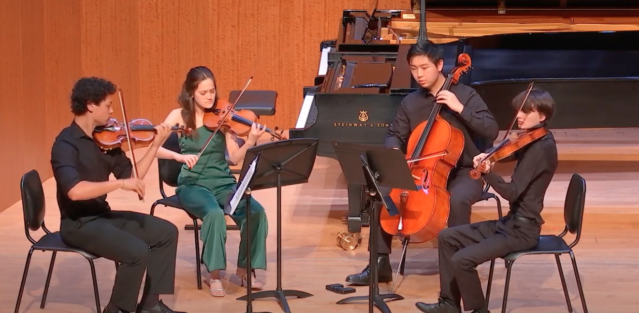
Five Pieces for String Quartet, mvts. 2 and 3 by E. Schulhoff
Schulhoff composed this piece in 1923. Each movement is inspired by a folk tune. We performed this piece 100 years since it was composed, in 2023. Performed at Caroline H. Hulme Concert Hall at SFCM.
Northern Lights by E. Esenvalds
Over the last few years, we've performed Northern Lights three times in my children's chorus, and every time, I was assigned a different voice part. Because I love how nicely the different parts fit together in this particular song, I decided to record this song but with all the parts performed by me.
Julia Florida
I chose to perform Agustín Barrio’s Julia Florida. The piece has classic harmonics and traverses through different keys seamlessly. I learned that Barrios was suffering from health and financial issues when he wrote Julia Florida.
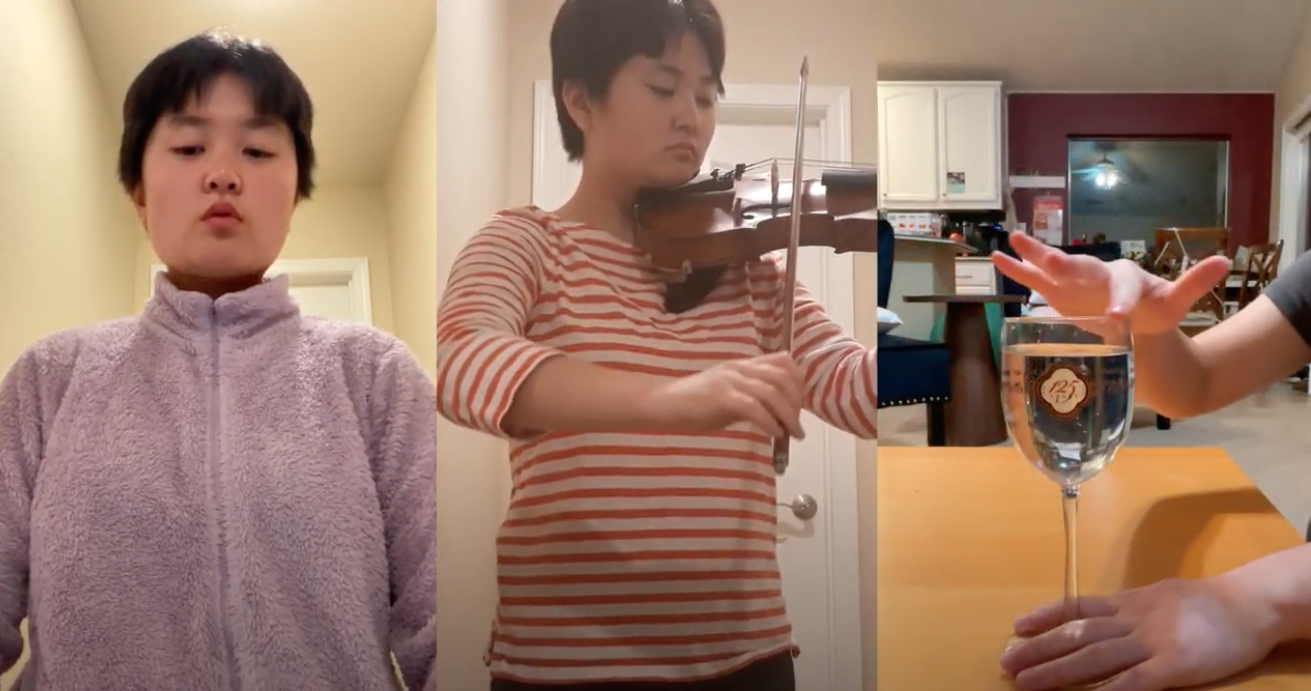
Melodic Ether
"Melodic Ether" is an introspective film following my personal connection with music, along with my analysis on that connection. This film was made during my time at a multimedia program where this was my final submitted work after a duration of six months in honing in on what i wanted to speak on in my own media.
Enlightened
Since I had such a strong concept in the beginning, I found little difficulty in conveying multiple correct ways to display this piece. I drew inspiration from “The Creation of Adam” by Michelangelo and took concepts from there as further inspiration. One side features a human hand and plants with simple patterns, organic shapes and a rising sun, while the other side has a robot hand, complex designs, and inorganic shapes like triangles and squares to further push the artificial themes. Depending on which way the project is displayed, one would see a human hand reaching down to a robotic hand, which could symbolize the advancement of technology and how human intelligence has developed so far it’s paving the way for artificial intelligence. If you flip it, you’ll see the robot hand above the human hand. This could mean artificial intelligence is helping humanity solve the problems it itself has caused. It could also be interpreted as artificial intelligence letting go of humanity to ascend past it, as AI has gotten out of control and is now superior to humanity. Alternatively, one with an optimistic lens might see it as a representation of the link between the past and future, and how humanity must acknowledge both in order to build a better world. I feel most successful in how I layered the cardboard pieces to convey a sense of depth, and to have accurately created a piece that has multiple orientations and multiple interpretations based on how it's perceived.
Delta Sleep Medley
Delta Sleep has been one of my favorite bands and a huge inspiration for my drumming the last 1-2 years. I think these two songs (Lake Sprinkle Sprankle and After Dark) are exceptionally challenging with frequent time signature changes, intricate hi-hat work with interesting choices for grooves.
一条毕业生
To me, the Bay Area is a place I feel at home for the first time, being of Chinese descent and having lived in rural America previously. The number of Asian students at UC Berkeley makes it so you’ll often hear Asian languages on the street. It’s comforting. The Chinese dragon in my linocut print is graduating from college, which represents the many Chinese students who have gotten the education needed for their futures right here in the Bay Area. The Chinese dragon is a concept thousands of years old, so its image carries the legacy and pride of Chinese people, who have been through civil wars and attempts at colonization, and were poor until rather recently. In America, especially for Chinese students, it’s seen as a threat for immigrants to get an education here and return to their countries. My artwork moves away from that narrative and into the truth that immigrants are as deserving of graduation as anyone else, and we should celebrate their success.
Wyoming
This painting captures the beauty of the breathtaking mountains in Wyoming, a place that is dear to me. My mother's family lives in Wyoming and I feel incredibly fortunate to be able to see the natural beauty of Wyoming every summer and winter. The little town is surrounded by mountains providing stunning backdrops we always explore the mountains and wilderness it has become a cherished family tradition that includes hiking horseback riding wading in the creeks or enjoying the wildflowers. I love wandering through the fields of Indian paintbrush and other wildflowers. The scent of sage brush and pine trees fills the air. That with the snowcapped mountains on the horizon are all part of the magic of Wyoming. This painting is filled with these memories-each stroke reflecting Wyoming’s beauty and tranquility. My wish is to share the love I hold for these mountains with those who may not have seen their beauty. I hope that through this painting others can glimpse the beauty of the Wyoming mountains.
Wound Jewelry
I created a piece of wearable art, specifically a choker necklace, to demonstrate the relationship between bandages and jewelry. Through the juxtaposition of the imagery of wounds and the adornment of the body I explored the relationship between the beautiful and the grotesque. By synthesizing the bandage and the beads, I constructed new meaning by portraying a wound as jewelry, allowing the viewer to reflect on what is part of their body and what is adornment.
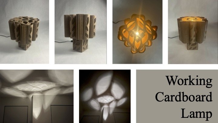
Working Cardboard Lamp
Excluding the bulb and wiring, this fully functioning lamp is made entirely of single-wall corrugated cardboard which I cut, carved, shaped, and peeled. The lamp was inspired by elements of art nouveau such as the use of natural curves as well as flora and fauna motifs, which are reflected in the cylindrical edges of the lampshade, and the leaf-like carvings on the sides and top of the lamp. The leaf shaped cut-outs on the top of the lamp not only function as a decorative element when the light is off, but also project an abstract leaf pattern on the ceiling when the light is on. To make the lamp work seamlessly, I made the shade removable so that the light bulb could be easily changed. In addition, to help the lampstand sit stably, I carved a rectangular opening in the side of the base for the cord to pass through without impairing the lamp’s balance. Finally, I made sure there were a few inches of space from every dimension between the cardboard, which is flammable, and the incandescent lightbulb so that the lamp would not catch on fire, and the glue would not melt, shifting the pieces of the lamp out of place. Although using an LED bulb would have avoided these problems entirely, working with an incandescent bulb challenged me to develop my design skills and think creatively but also pragmatically, working around restrictions and ultimately creating both a beautiful and functional product.
Wonder
My piece, titled "Wonder," depicts a young child clinging onto his mother's back, gazing out at his audience with curiosity-filled eyes. Even before starting to sketch, I found myself captivated by my reference photo, by the wonder in the child's eyes. He reminded me of my younger self, curious about everything in the world around me; from a dog barking on the street to a rainbow appearing in the sky after a light shower, many of these everyday occurrences for us, now, were once so new and fascinating to us as children. What changed? I pondered over this transformation from wide-eyed innocence to a more practical outlook on life as I sketched over the period of three days, each one an eight hour cycle of eat, draw, eat, draw, eat, sleep, repeat. The child's gaze, filled with such fascination and awe, became a portal through which I could revisit my own past, a nostalgic reminder of the time when I was eager to explore even the simplest of things. "Wonder" is not just a simple drawing of a child and his mother; it's a reflection on the universal journey of growing up and the inevitable transformation of our perspectives. Though the fragility and beauty of those fleeting moments may be difficult to rediscover, I hope that this piece invokes within the viewer that same sense of innocent curiosity about the world, serving as a reminder of the precious, ephemeral nature of childhood wonder.
Wild Wings
I created this piece for my mother. She has always encouraged me to be creative and branch out of my comfort zone. Seven years ago, after her divorce she began to plant garden made entirely of native plants. Her garden is a constant reminder and inspiration to me about how you can turn difficult and challenging experiences into something beautiful. That's why the wings of my watercolor butterfly are painted and filled in with the same native plants I see in my California community and garden. I love butterflies, their message of transformation and rebirth reminds of that life is also movement and change, and we can choose to adapt in ways that are beautiful.
When I Was a Little Girl
Through this piece, I wanted to explore the concept of memory in a way where young and pleasant memories, such as childhood, often become distorted, forgotten, even lost entirely when one reflects back to it in the future, emphasizing the effects of the comparatively bleak reality of growing up. Using charcoal establishes a monotone, old photograph-like setting, and the duality of black and white conveys the simultaneous presence and absence of the memory. The face of the girl may have been one of happiness, sadness, surprise, or many other expressions; by replacing her face with a gaping hole, the portrait becomes slightly unsettling, as the void challenges conventional notions of recognition and highlights the haziness of our past selves in a distant memory. Back then, what did I feel? What did I think? Who even was I? Questioning the boundaries of reflection and the mysteries that lie within, I invite the contemplation of identity through the duality of remembering as well as forgetting. By visualizing this feeling through the piece, I seek to evoke a shared sense of wonder about how well we truly know the little children residing within our memory.
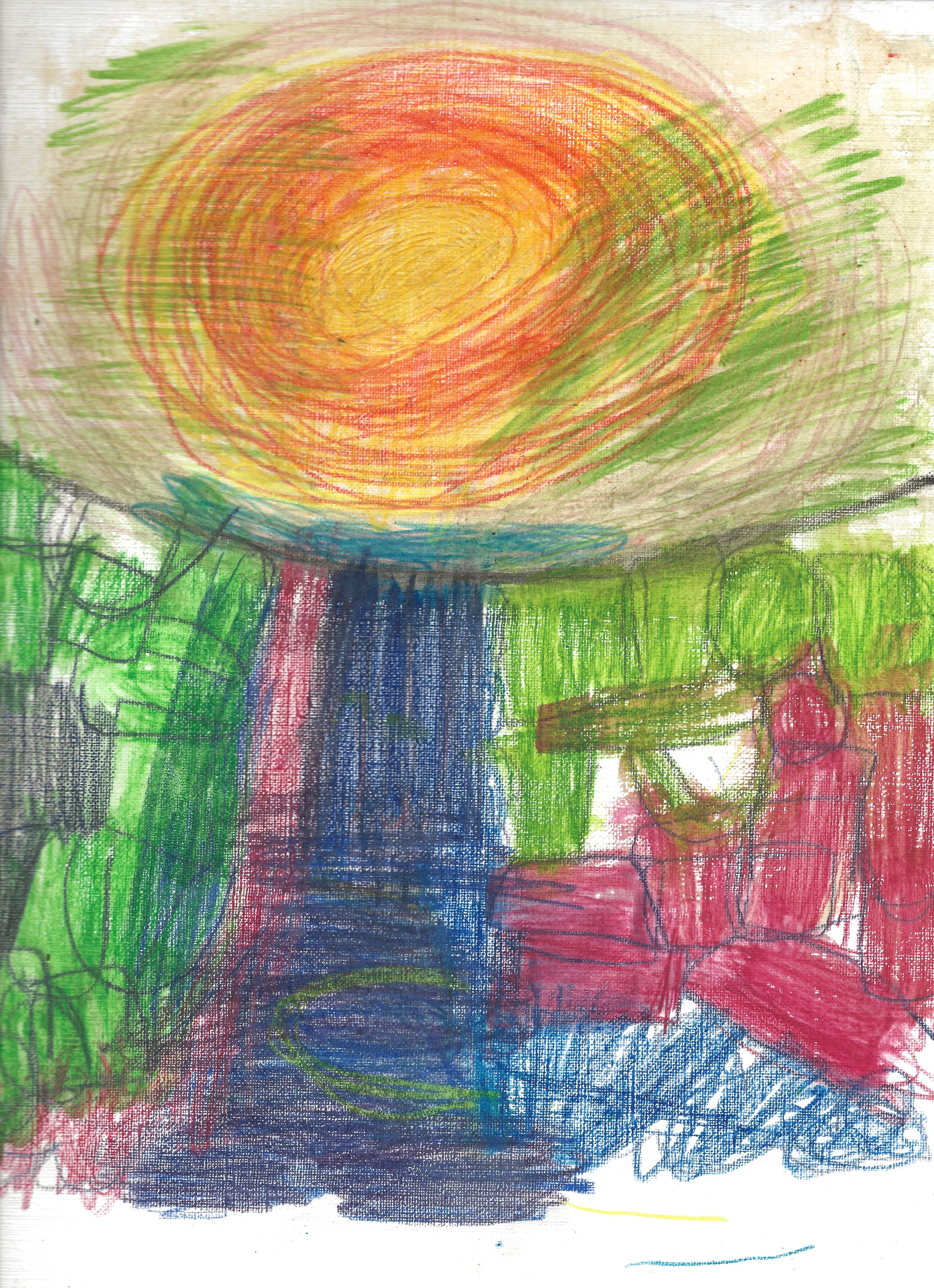
Waterfall
My name is Katie. I have autism and struggle with speech. My mom and I communicate with speech (a little), sign language and spelling on a letter board. My mom helps me with typing because I can't do that yet. I attend a school in Menlo Park called Open Mind School. Before that, no one taught me anything, and definitely not art! I love art. Art is freedom. I don't have much freedom. My art teacher showed us a painting of a waterfall with rocks. I liked it, but wanted mine to be more colorful! There was energy in the water. I needed color to express the energy. I know what the colors should be, but sometimes my feelings about what I am creating influence my color choices. I like to do art because it allows me to express myself better than with words. Words are difficult. Sometimes impossible. Art allows me to express things I can't say in words.
Utah Dreaming
For this piece, I chose to make the work a letter B to represent my name, Ben. I constructed this letter in a western font style because I wanted to have the piece reflect my love for the western style and scenery. I constructed a cowboy hat that I put on top of my letter, three western style buildings, bullet impacts on the back, a desert mountain, river and cactus on the interior of the letter, and I covered the entire piece with large and small scratch and wear marks. While constructing this piece I wanted to give it a worn and dirty look which I used the large and small scratches to achieve. The cowboy hat I also used a darker black glaze for the first layer removing parts and then three layers of a lighter black to give it a worn and used look. For the western town I included a mix of bright, dull, and varying colors to create a lot of variation and life while sticking to the western theme. The bullet impacts I glazed with a metallic bronze and the mountains with multiple colors including a black, brown, and tan that I removed and layered to bring more dimension. The river and cactus I used a green and light blue for to help bring focus to the interior parts of the letter.
Until the Last Flower
This piece represents the occurrence of an overshoot where humans take away all the resources the Earth provides us until we pluck the last flower out. The hand and the surrounding is formed by sand which represents the population of 8 billion people that inhabit in Earth. The yellow daffodil represents the last hope and the future of our lives which will be stolen when all of nature's gift is taken away.
Under Pressure
The feeling of drowning in pressure is a reality in the sport of water polo. I wanted to capture the tightness of this suffocating feeling and add the back layer to convey the loneliness of it. This feeling is not limited to water sports. Many teenagers feel as if they are drowning under the expectations of life and no one can understand. My hope is that we can be seen and viewers can relate, even for a split second, when they see this piece. My artistic process started with a thumbnail sketch and reference photo taking. The idea evolved into a sketch and blocking in colors. I first tried to block in the colors on the sketch with gouache. The gouache and the choice of reference picture weren’t working. The gouache didn’t sit the way I hoped it would. I had to make the executive decision to restart the piece. My idea was very strong, but the execution didn’t go as planned. I started over with a different reference photo, one that I felt the feeling of drowning was captured better and I switched to poster paint, which was still out of my comfort zone but I liked the look better. After finishing the main subjects painting, I started to add the elements around the face and the background. I used foam to add more depth. I also used CD cases and wooden blocks to give the background more distance from the main part.
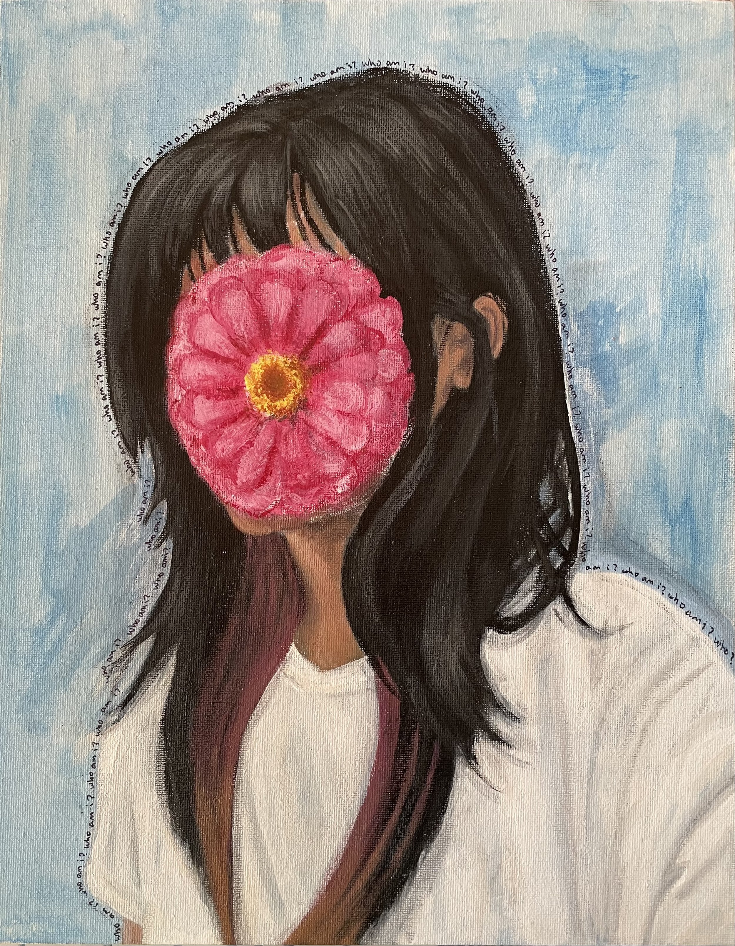
Undecided
I’ve always never truly knew who I am, and every time I thought I did, my view of myself would constantly change. This painting really helped me uncover this feeling with honesty. A difficulty I faced while painting was blending and shading the skin, hair, and clothes. As you can see, my face is covered with a Zinnia. Zinnia’s represent everlasting love, in the painting, it represents the fact that even though I may never know who I was meant to be, I love the way I change and experience different lifestyles. You may also notice text written around the painting, the text reads “who am I?” which connects to my confusing interchanging identity. I hope this painting helps inspire others to take their complicated feelings into meaningful paintings.


